Wow! That was my first thought when I saw this photograph on Instagram. I love the composition and the color palette is a show stopper. The combination of black, chocolate brown, ivory and bright blue is unforgettable. This would make such a fun interior design. Here's how I picture this look ...
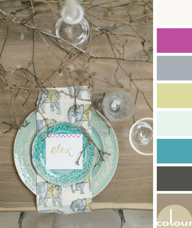
MAGNOLIA FROLIC
I just love rustic designs with a 'pop' of bright color. The 'Magnolia Frolic' palette is all that and more so, naturally, I love it! I'm especially drawn to the turquoise and chartreuse accents with just the slightest touch of hot pink. Lovely! Of course, I had to develop an interior mood board for ...
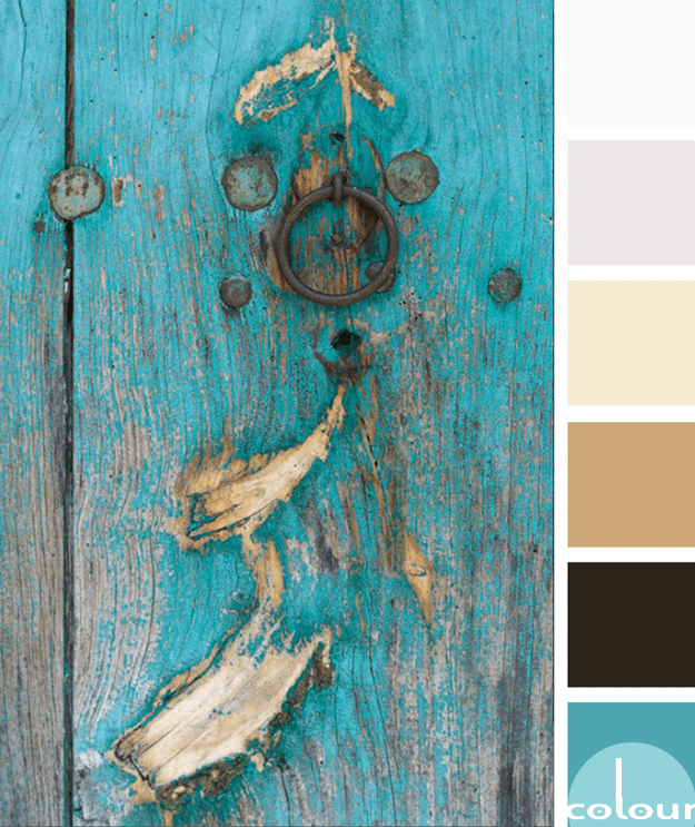
WEATHERED PERFECTION
There is something about old, weathered doors that just captures my heart. I'll often wonder about their history and the things they've seen. How did that scratch get there? Who's fingerprints have gradually faded the paint around the latch? Actually, I find a lot of my inspiration from photographs ...
SUNKISSED MOMENT
This palette is both classy and down-to-earth all at the same time. Not a common combination to see together but it works beautifully. The white and putty primary colors make the perfect backdrop to the golden yellow, deep green and black accents. This look would make a gorgeous interior design. I'm ...
VISION IN BLACK
Black. Blush. With just the right amount of metal accent. This color palette is perfect for a bright, sophisticated look. I love the blend of the soft blush-beige color with the edgy black accent. Surround these with light grays and whites for a lovely, ethereal look. Adding just a slight amount of ...
- « Previous Page
- 1
- …
- 9
- 10
- 11
- 12
- 13
- Next Page »


