Working with a neutral color scheme can be tough. How do you pull this look off without coming across as boring or bland? The key is keeping the color palette lively while maintaining neutral shades in the combination. It also doesn't hurt to add a pop of warmth with an accent color in the ...
MASCULINE STYLE
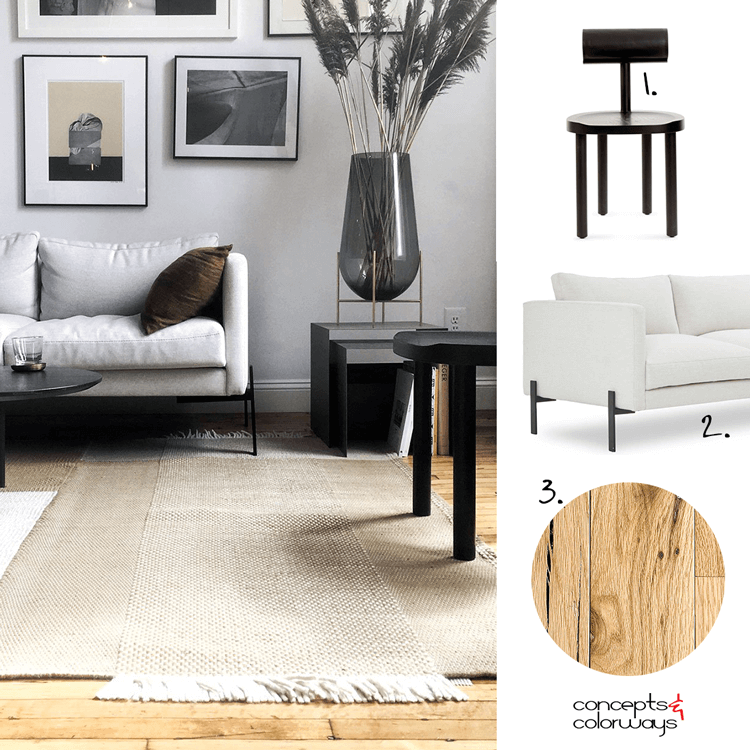
It's always an exciting day for me when I find a new source of design inspiration. Today that source comes in the form of the online TRNK furniture catalog. This living room photo is what beckoned me to their website with it's inviting oak floors and masculine style. I just couldn't wait to share ...
WHISPER OF GREEN
Oh, to have my very own home office. A girl can dream (sigh). Unfortunately, it just isn't in the cards for me right now. But, if I were to dream up the perfect home office for me, it would start with this color palette. White walls (they are my fave) with black accents. A light, natural wood floor ...
e7e2dc | A SANDY GRAY
This sandy gray color is a subtle mix of a light tan and a warm gray tone. It's one of those 'hard to describe' colors with lots of depth to it. I guess you could call it a putty gray, sand gray, oyster gray or maybe a pearl gray. Whatever you call it, this is a great neutral choice that works well ...
RED BANDANA
This is such a clever use of a classic red bandana. I've always liked these with their bright red color and white lace-like patterns. When I see one of these iconic handkerchiefs, I think of cowboys. And, I just love how they were used in this western-themed table setting photographed by Megan ...


