
The 'Burgundy Sprout' color palette is inspired by this gorgeous photograph by Frida Ramstedt of Trendenser. When I first saw this image, the dark burgundy plant was the first thing to catch my eye. But, then I noticed the lovely texture of the concrete pot and the adorable modern wood bird ...
POSH FARMHAND
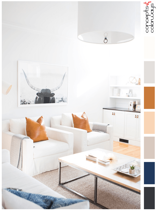
This white living room design has the perfect amount of detail and color accents to keep it from being bland. I love the minimalist look and the gorgeous color palette. The Highland cow print and maple floors add a nice connection to nature. But, let's talk about the basics of this look. The color ...
ECLECTIC SYMMETRY
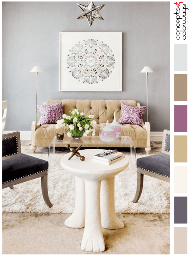
This color palette is just gorgeous! I love the combination of blush sand, dark lilac gray, ivory, camel tan, plum, light brown and soft gray. This look is soothing yet full of life. It has a sophisticated quality that is great for formal spaces yet is playful with whimsical pieces. A perfect ...
HAPPY HOUR
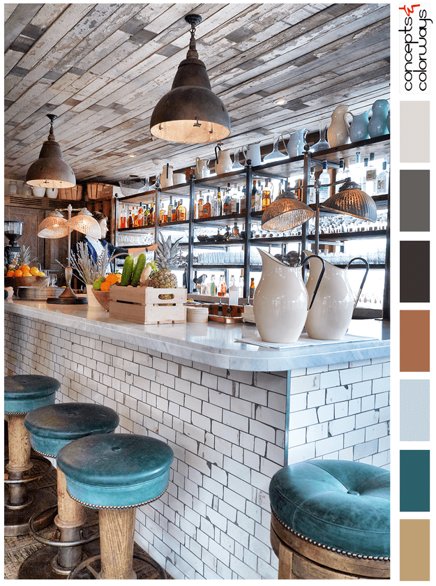
The 'Happy Hour' palette is a chill look with a "put your feet up and stay a while" kind of vibe. This look is all about reclaimed wood, weathered subway tile and dark teal accents. The color palette consists of a light brown, dark teal, pale blue, copper brown, warm black, charcoal gray, pale gray ...
SIENNA LACE
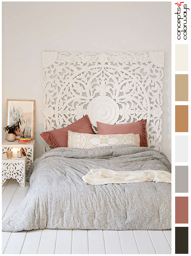
The 'Sienna Lace' palette is a soft ivory look with warm gray and dusty pink accents. Smaller touches of light gold and black are also used to balance the design. The complete color lineup is an ink black, dusty rose, warm gray, pale gray, warm gold, light gold, ivory and warm white. This palette is ...