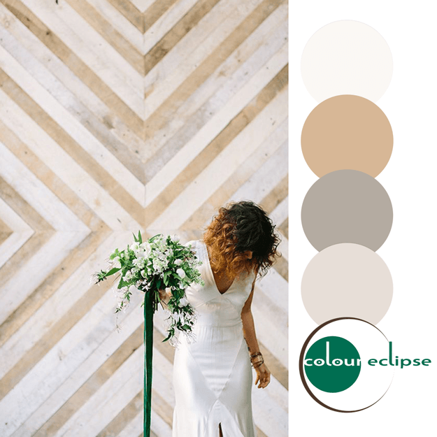
How do you make beige more interesting? Well, you could always combine it with some bold, saturated color accents in a mid-century modern design. Think, dark blue, hot pink, bright red, burgundy and lush green. It's a lot of bold color, I know, but you can balance the look out by using white walls ...
PURPLE MEADOW
The 'Purple Meadow' palette translates beautifully into an interior design. I absolutely love the purple and green combo! It looks so elegant in a white room with a creamy secondary color. The small bits of beige, slate blue and gold add visual interest without overpowering the look. Here are some ...
PURPLE MEADOW
I'm totally loving this purple and green color combination. Especially against a white backdrop. The soft beige tones, copper and slate blue tones add interest while maintaining harmony in the look. This color palette would make a beautiful interior design. Don't you think? Coordinating posts ...
PANTONE LUSH MEADOW
Introducing, today's Color Trend: Lush Meadow! More specifically, Pantone 18-5845. Today's color was selected from the Pantone Fashion Color Report Fall 2016. This emerald green color is a refreshing accent in a mostly white room. It also contrasts nicely with warm wood floors. Or, bring ...
ETHEREAL EDGE
So, how would you translate this color palette into an interior design? I have some ideas brewing for a home office. Here's what you need for this 'Ethereal Edge' look. Start things off with a weathered gray wood-look porcelain floor layered with a beige patterned rug. Place a reclaimed wood desk in ...


