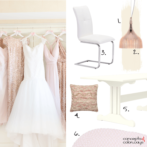
Yesterday we looked at the 'Blush Beauties' color palette. So, today let's explore how we can translate this palette into an interior design. I'm picturing a dining room with a blush beige wall paint and cream colored wood trim. A pale pink rug under the table adds a pretty touch to the look. ...
BLUSH BEAUTIES

What a heavenly color palette! I just love the layers of blush tones and creams with an accent of white and rose gold. This look is pretty enough for a little girls room but is sophisticated enough to work for grown up girls too. It might be a bit too much pink for most men but it could work in the ...
SHIBORI BLEND
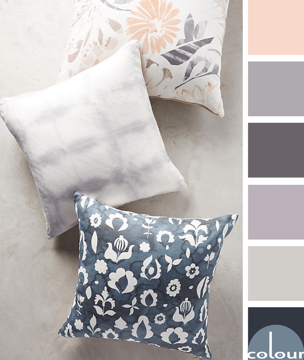
I just love the textures and patterns that Anthropologie comes up with. This pillow combination is a perfect example. The patterns are fantastic and the color palette...just gorgeous! The majority of the palette consists of soothing cool tones of navy blues and lilac grays with a warm base color of ...
PEACH COLOR POP

Sometimes the less color you use in a space, the more dramatic the effect. Kind of like this neutral living room design of black and gray tones with one colorful object. In this case, a blush peach sofa. So, what does it take to get this look for yourself? Let's break it down. Start with a warm gray ...
PEACH COLOR POP

This look reminds me of those black and white photos with one object in color. I've always loved those. So much drama! This effect can easily be recreated in an interior design with a palette of grays, blacks and whites with just one color accent in the room. In this case, a beautiful blush peach ...