
I'm a huge fan of color palettes with neutral base tones and small amounts of colorful accents. Using bold, saturated colors sparingly seems to lend more drama to the overall look. And, It's a nice way of adding a playful touch to an otherwise 'safe' room. The 'Primrose Vision' palette uses a creamy ...
THOUGHTFULLY GIFTED
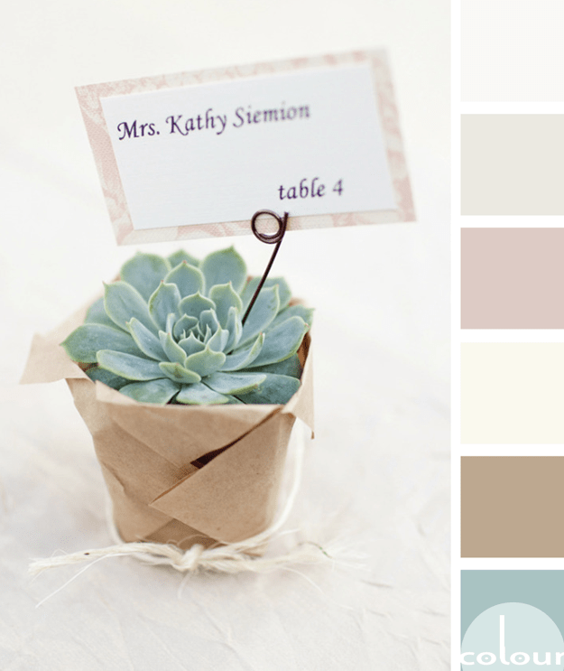
If you're looking for a refreshing color palette with a relaxing vibe, there's no better inspiration than succulent plants. I've always been a fan of these little guys. They're beautiful yet easy to take care of. The perfect combination! This particular palette is especially nice with it's muted ...
SHERWIN WILLIAMS STARDEW

Today's color trend is a hard one to pin down. It's sort of a cross between a robin's egg blue and a duck egg blue. Some might even call it a eucalyptus green. It's a soothing blue-green color that adds a hint of a retro feel but in a trendy, current sort of way. Sherwin Williams calls it 'Stardew' ...
PANTONE LIMPET SHELL
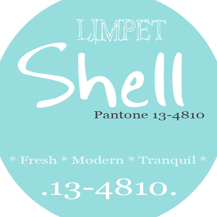
Introducing, today's Color Trend: Limpet Shell! More specifically, Pantone 13-4810. Today's color was selected from the Pantone Fashion Color Report Spring 2016. Add softness to your bedroom design with an all white color palette and a 'pop' of limpet shell. Shop this color (some cool ...
DOUBLE MINT

So, how would you translate this palette into an interior design? Here's a little something I have in mind for this look... Light Fixture: Square Salvaged Barn Tin Chandy in Robins Egg Blue from Urban Chandy Flooring: Irongray Engineered Oak from wood4floors Table: Camille Dining Table ...