
I'm a huge fan of color palettes with neutral base tones and small amounts of colorful accents. Using bold, saturated colors sparingly seems to lend more drama to the overall look. And, It's a nice way of adding a playful touch to an otherwise 'safe' room. The 'Primrose Vision' palette uses a creamy ...
URBAN OLIVE GROVE

This palette is neutral to the point of almost being black and white. But, if you look closely you see subtle color variation that adds a spark of life to this urban look. The primary accent color is a lovely olive gray with the remainder of the lineup being a charcoal black, industrial gray, ...
COLORFULLY VIBRANT

Wow! That was my first thought when I saw this photograph on Instagram. I love the composition and the color palette is a show stopper. The combination of black, chocolate brown, ivory and bright blue is unforgettable. This would make such a fun interior design. Here's how I picture this look ...
MAGNOLIA FROLIC
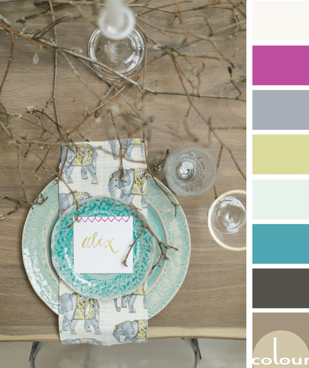
I just love rustic designs with a 'pop' of bright color. The 'Magnolia Frolic' palette is all that and more so, naturally, I love it! I'm especially drawn to the turquoise and chartreuse accents with just the slightest touch of hot pink. Lovely! Of course, I had to develop an interior mood board for ...
PANTONE ICED COFFEE

Introducing, today's Color Trend: Iced Coffee! More specifically, Pantone 15-1040. Today's color was selected from the Pantone Fashion Color Report Spring 2016. This light brown hue looks absolutely beautiful as the primary accent in white rooms. Adding leather pieces to your design is a ...