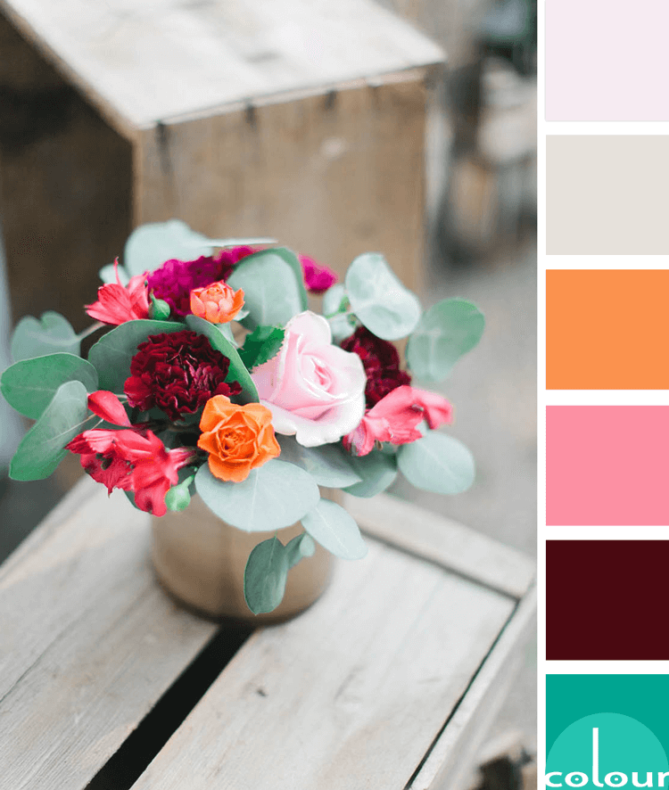
Floral bouquets are such a great source for color inspiration. There are infinite ways to arrange these and virtually infinite numbers of flowers and foliage to do it with. When it comes to Pinterest eye candy, this is one of my most favorite subjects. Take this pretty little pink and green number ...
e7e2dc | A SANDY GRAY
This sandy gray color is a subtle mix of a light tan and a warm gray tone. It's one of those 'hard to describe' colors with lots of depth to it. I guess you could call it a putty gray, sand gray, oyster gray or maybe a pearl gray. Whatever you call it, this is a great neutral choice that works well ...
RED BANDANA
This is such a clever use of a classic red bandana. I've always liked these with their bright red color and white lace-like patterns. When I see one of these iconic handkerchiefs, I think of cowboys. And, I just love how they were used in this western-themed table setting photographed by Megan ...
BURGUNDY SPROUT
The 'Burgundy Sprout' color palette is inspired by this gorgeous photograph by Frida Ramstedt of Trendenser. When I first saw this image, the dark burgundy plant was the first thing to catch my eye. But, then I noticed the lovely texture of the concrete pot and the adorable modern wood bird ...
PANTONE NEUTRAL GRAY
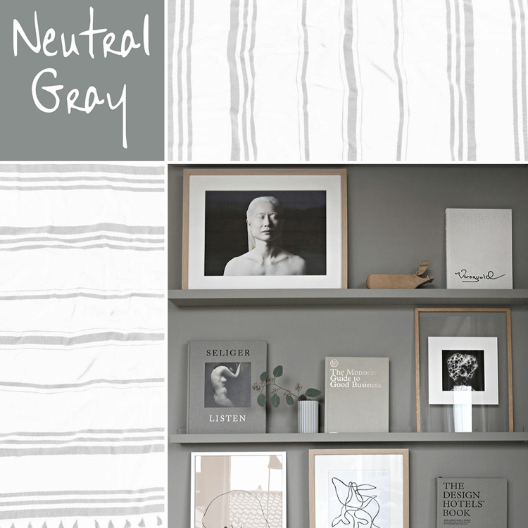
It always amazes me how the right shade of gray can make a design so darn pretty. I mean, gray is about as neutral and bland as you can get right? So, how can it literally transform a space from a dull room to a showpiece? One particular shade of gray that really catches my eye is Pantone's Neutral ...
- « Previous Page
- 1
- 2
- 3
- 4
- …
- 7
- Next Page »


