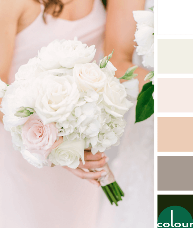
There's something about a pale pink and green color combination that really catches my eye. It's soft and feminine but with a pop of deep lush accent. Throw in some dreamy white details, blush beige tones, a taupe gray shadow and just a hint of ivory and you have an absolutely gorgeous look. This ...
DRAMATIC FLAIR
The 'Dramatic Flair' palette is a dark one with small amounts of white accent. It's great for eclectic style interiors, industrial modern styles and anywhere you want a dramatic flair. The color line-up includes a cool black, charcoal gray, burnt orange, dark bronze, emerald green, golden yellow and ...
OPPOSITES ATTRACT
The 'Opposites Attract' color palette is inspired by a black sesame gelato recipe from Super Nummy. It features the grayish-brown color trend from Sherwin Williams called Sealskin that I showed you here. The rest of the palette is a blood orange, light peach, pale peach, cool gray and cool white. ...
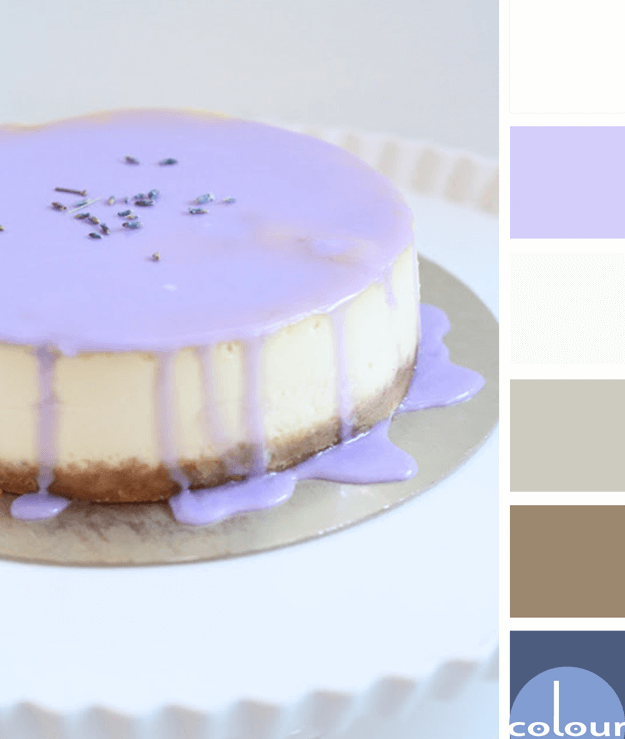
LAVENDER CHEESECAKE
I'm always up for a dessert based color palette. This lavender drizzle makes such a beautiful display for your table but you could also use this palette for other designs. The color lineup for this look is a pale gray, white, periwinkle blue, pewter gray, warm brown and dark blue. The combination is ...
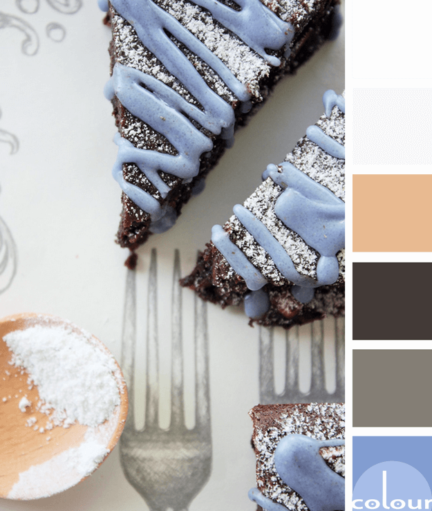
LAVENDER BROWNIES
The 'Lavender Brownies' color palette is a yummy mix of dark brown with lavender blue. The main colors of the look are white and pale gray with a sprinkle of rose beige and metal gray as well. This palette displays the periwinkle color trend quite nicely, don't you think? I'm brewing up some ideas ...
- « Previous Page
- 1
- …
- 3
- 4
- 5
- 6
- 7
- …
- 11
- Next Page »


