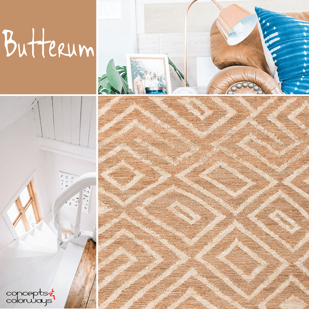
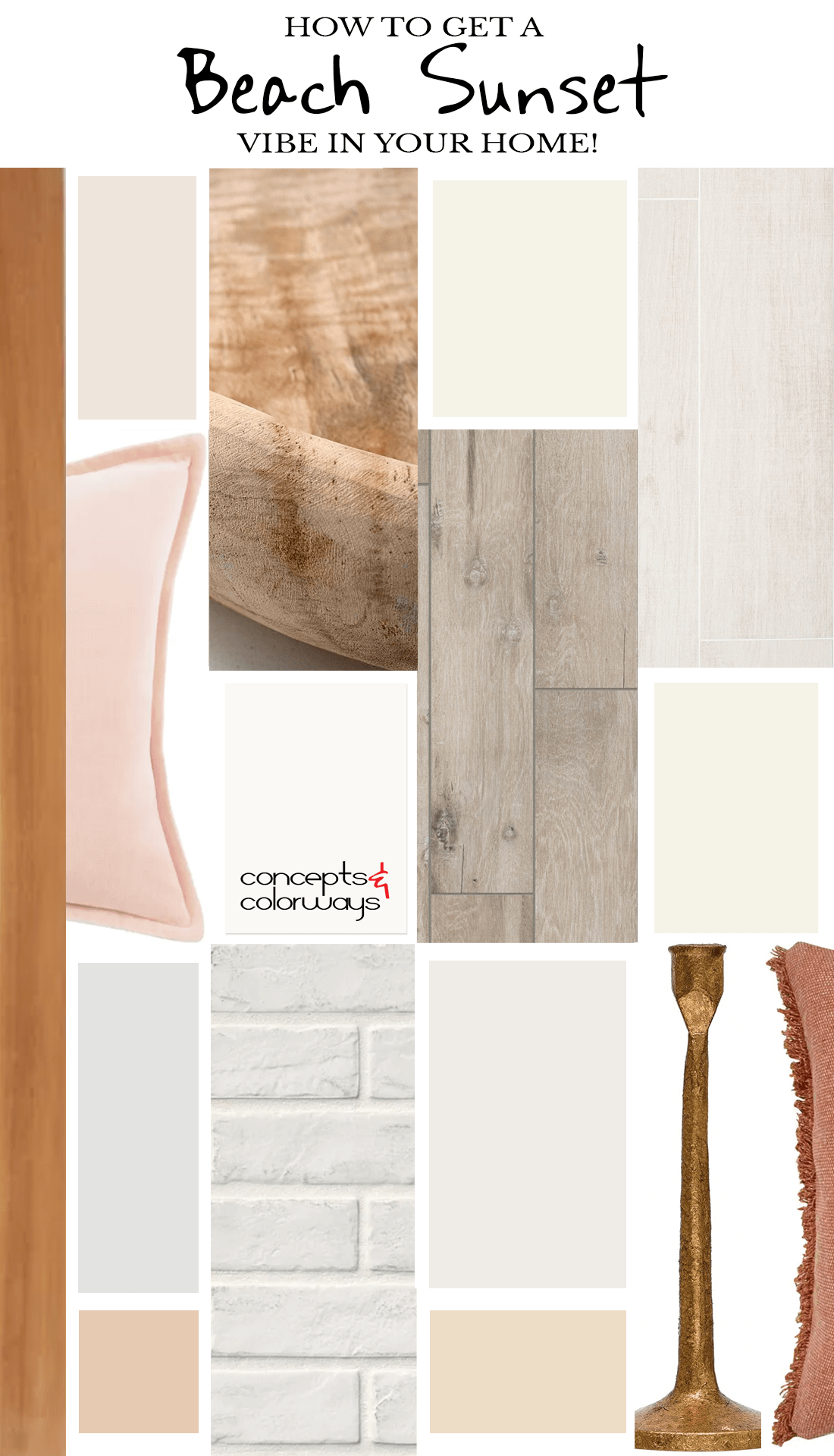
Do you have a happy place? You know, that one place in the world that relaxes you and fills you with utter joy? I have a few of them myself. But, top on the list would most definitely be the beach at sunset. The warm air, the sand between my toes and most of all, the beautiful colors, all come together to create the perfect moment. That’s how this collection of warm neutral paint colors was born. So we could all recreate that ‘beach sunset’ vibe at home.
I mean, think about it. Wouldn’t it be awesome to come home to a bright and airy home filled with the colors and textures of the beach? I like the sound of that! If you do too, stay with me, and we’ll explore the paint color palette, finishes and decor that could bring this vision to life.
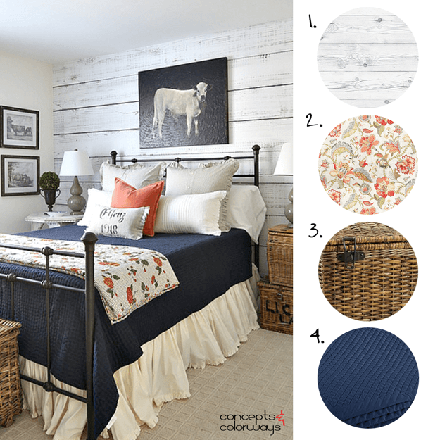
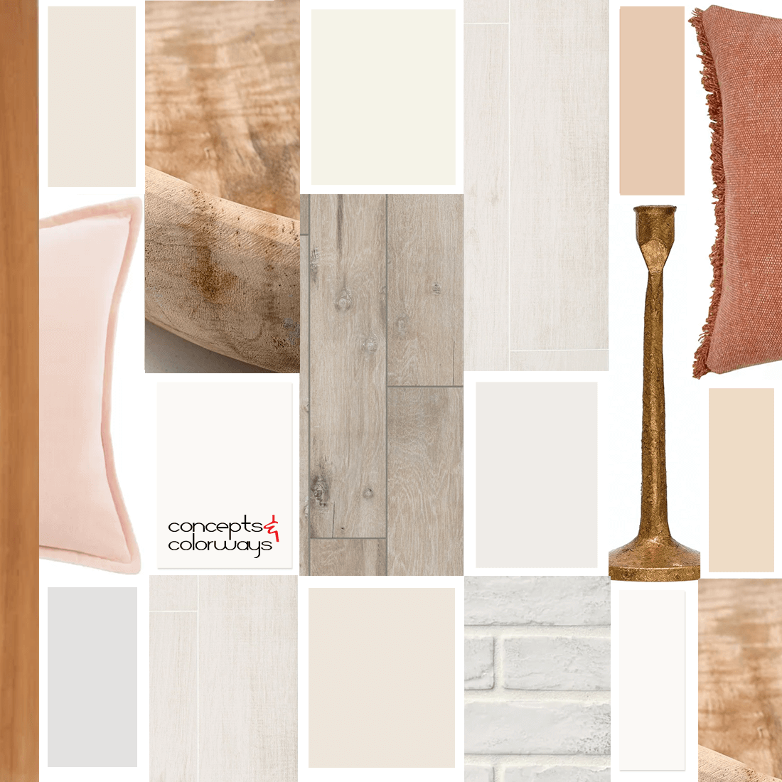
These are the Items I included in the Interior Mood Board Above…
Kauai Outdoor Teak Lounge Chair by Safavieh from Perigold | Norwin Throw Pillow in Peach from Birch Lane | Teak Wood Bowl from Pottery Barn | Kenridge White Matte Porcelain Wood Look Tile from Tilebar | Shaw Harvest Matte Tile in Oat by Shaw Floors from Build.com | Capella White Brick Matte Porcelain Tile by MSI from Home Depot | Cast Iron Taper Candle Holder in Gold Finish from Creative Co-op | Neera Adobe Clay Brown Solid Throw Pillow by LR Home from Home Depot | Paint Color Scheme
*This mood board is a great starter template to use when putting your interior together. It not only shows the paint color palette, but it also shows some recommended finishes and decor to complete the beach sunset look. Of course, you can add in additional materials, textures and patterns for a custom design all your own. But, having the mood board handy when selecting interior items can help you coordinate it all to perfection (chefs kiss!)
Let’s take a closer look at the basic elements needed to translate this look to a warm and airy interior design…
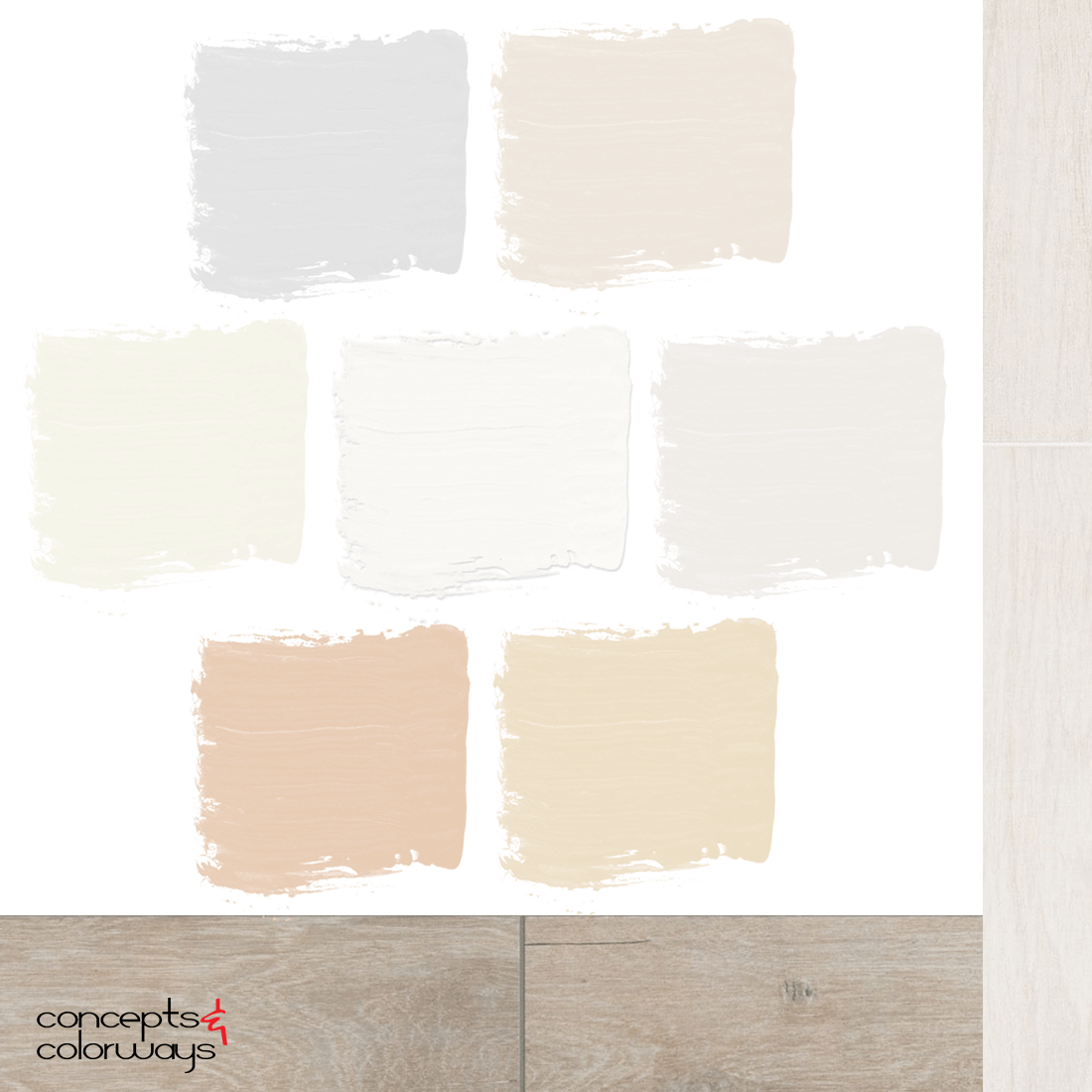
Warm Neutral Paint Colors that includes Sherwin Williams High Reflective White
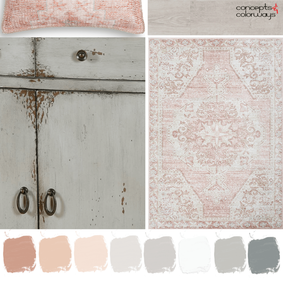
When putting an interior design together, I like to start with the color palette. The colors you choose for a space can make such a huge difference in the final look. Trust me, if you belly flop on this part, you will not be a happy camper. So, let’s start with looking at the neutral paint colors that create this beach sunset look. The combination of ivory white, light gray, bright white, light taupe, light tan, sand brown and light beige all come together in a subtle, but eye-pleasing way. I especially like how these colors can liven up a mostly white room (in this case Sherwin Williams High Reflective White). Just gorgeous!
If you would like to get the actual paint colors in this palette (including manufacturer, color name and number), you can purchase them from my Etsy shop here.
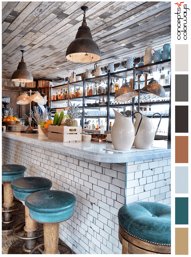
A White Wood Tile Option for Flooring or Accent Walls
To keep with the warm and airy theme, I chose a white wood tile floor finish for this look. But, you could also use this tile on an accent wall or kitchen backsplash. Even a fireplace surround would do the trick. There are many ways you can work this material into the design. So, let your imagination run wild!
A Rustic Gray Wood Tile for a Darker Flooring Option
Some of you might be thinking, “White floors, really?”. I hear you and I get where you’re coming from. White floors aren’t for everyone. No worries though, I’ve got you covered with a rustic wood tile that’s a dreamy shade of gray. This choice will give you more dirt hiding power in those high traffic areas of your home. A mud room maybe? Or, if you have kids, pretty much the whole house! (been there, still doing that).
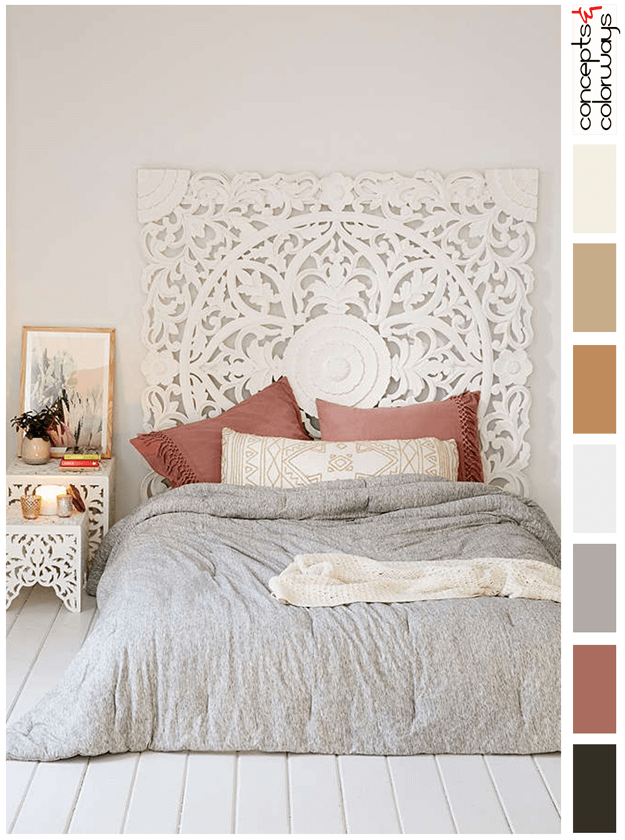
Dusty Peach and Rust Red Accents
This is the part that brings in those sunset colors. So, please don’t forget the dusty peach and rust red accents! These colors play so well with the colors in the paint palette and add a variety of warm tones that are so cozy. There are so many ways you can incorporate these colors into your home. What I’m picturing are throw pillows and bedding. But, you could also add rugs, upholstery and artwork in these pretty accent colors.
Teak Wood Furniture and Decor
Oh, how I love teak wood! Especially, when it has a yummy warm, orange-brown stain color. This finish fits in perfectly with a beach sunset inspired interior and coordinates well with this paint palette. It’s quite stunning, actually. Incorporate this texture and color to your home with teak wood furniture, either inside or outside, on your deck or patio. Or, if you’d like to use smaller amounts of this color in your design, use teak decor pieces instead.
Kauai Outdoor Teak Lounge Chair by Safavieh from Perigold | Norwin Throw Pillow in Peach from Birch Lane | Teak Wood Bowl from Pottery Barn | Kenridge White Matte Porcelain Wood Look Tile from Tilebar | Shaw Harvest Matte Tile in Oat by Shaw Floors from Build.com | Capella White Brick Matte Porcelain Tile by MSI from Home Depot | Cast Iron Taper Candle Holder in Gold Finish from Creative Co-op | Neera Adobe Clay Brown Solid Throw Pillow by LR Home from Home Depot | Paint Color Scheme
White Brick Accent Walls
Now, it’s time to work in some texture. One of my favorite ways to do this is with painted white brick. It adds instant character to a room that’s truly timeless. There are many ways to work this texture into your design. Either with real brick, or with a brick textured wallpaper or tile. You could also paint some tired, old brick already in your home to transform it to a stunning new feature.
Rustic Wood Textures
Another source of texture for this look is with rustic wood details. Choose pieces with a lot of heavy wood grain to ramp up the texture even further. Things like carved wood bowls or serving boards are a great way to go. You could also work reclaimed wood shelves or mantels into the space for that rustic wood look. Small furniture pieces, like side tables or stools would work great also.
Antique Gold Details
When trying to recreate sunset colors in an interior, antique gold finished metal just seems like the way to go, don’t you think? With this color palette especially, antique gold toned metal is a perfect fit. Add this finish to your home with small details like picture frames, candlesticks or lamps. Or, work this color in with ochre brown upholstery fabric and artwork to give that antique gold vibe.
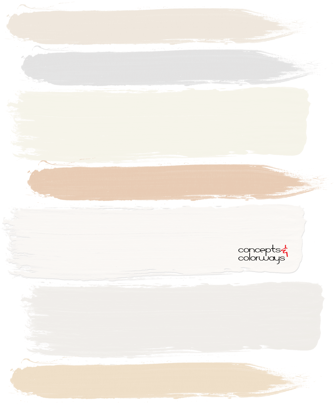
More About those Yummy Warm Neutral Paint Colors
We went over the color palette earlier. But, now let’s talk a bit more about where to apply these colors. Of course, there are many different ways you could distribute these throughout your home. Here’s what I have in mind. Start with using the bright white on the walls and trim in the main living spaces of the home. Then, work the other light toned colors in the other rooms for variety (ivory white, light taupe and light tan). Next, comes the accent paints (light beige, sand brown and light gray). Use these hues on accent walls and also on doors for a ‘pop’ of color. Or, work these accents into the space with painted wood furniture pieces like side tables or accent chairs.
If you would like to get the actual paint colors that coordinate with this palette (including manufacturer, color name and number), you can purchase them from my Etsy shop here.
I hope you enjoyed my version of a beach sunset interior with warm neutral paint colors. Above all, I hope it brings up lots of ideas for you to use in your own home. Happy designing!
Other colors and palettes you might like…