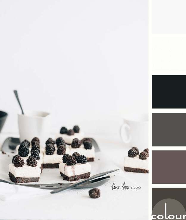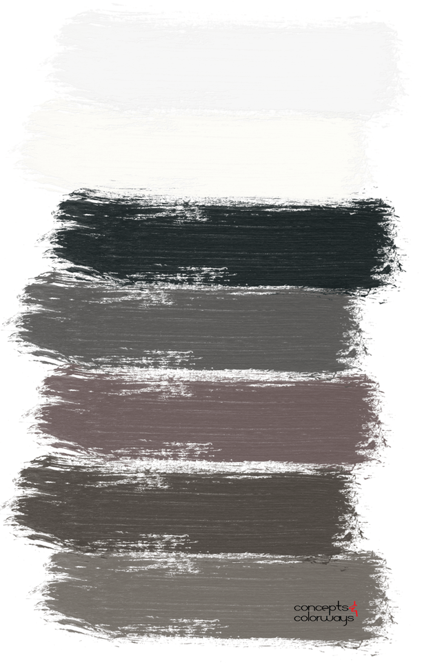
I like this take on black and white photography by Two Loves Studio. It isn’t really a black and white photograph but, instead is a photo of a black and white subject. What I like most about this palette is that it isn’t just black and white. Instead, it’s a blend of various dark and light colors. Blackish-brown, dark plum, slate gray, blackberry, pale gray and creamy white are all represented in this look. The variation in color tones gives this black and white color palette just the right variety to keep it interesting. I can totally picture this palette in an interior design project!
Here’s a look at the ‘Blackberry Cream’ paint palette…

Coordinating posts you might like…


