Beige isn't the kind of color people get really excited about. But, it's a necessary neutral to have handy when putting together a great color palette. This color can create a beautiful neutral interior when you pair it with lots of texture and patterns. You can also use this color as a base and ...
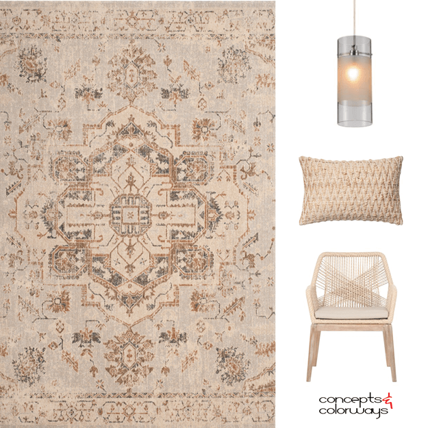
e7e2dc | A SANDY GRAY

This sandy gray color is a subtle mix of a light tan and a warm gray tone. It's one of those 'hard to describe' colors with lots of depth to it. I guess you could call it a putty gray, sand gray, oyster gray or maybe a pearl gray. Whatever you call it, this is a great neutral choice that works well ...
191e07 | AN ENCHANTING BLACK

1.Emory Rug | 2. Parker Dining Chair | 3. Dhurri Pillow | 4. Wire Basket If I had to choose one favorite accent color, I would definitely go with black. It goes with just about everything and creates a bold statement in any interior space. Like all colors, black comes in a variety of different ...
A COASTAL STYLE LIVING ROOM WITH TURQUOISE, GOLD AND TAUPE ACCENTS

I can't get over how much I love this design! The color palette is just gorgeous, don't you think? This look was inspired by my Turquoise Waters color palette that we looked at on Friday. I wanted to explore this palette further and create a living room mood board showing how these colors could work ...
TURQUOISE WATERS

The 'normal' person would look at this photo and wish they were at the beach. Or, they might picture themselves sitting on the rocks dipping their toes in the water. And, I have to admit that thought has crossed my mind too. But, it isn't the first thing I thought of. Oh, no. That would be too ...
- « Previous Page
- 1
- …
- 21
- 22
- 23
- 24
- 25
- …
- 119
- Next Page »
