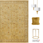
The ‘normal’ person would look at this photo and wish they were at the beach. Or, they might picture themselves sitting on the rocks dipping their toes in the water. And, I have to admit that thought has crossed my mind too. But, it isn’t the first thing I thought of. Oh, no. That would be too ‘normal’. Instead, I thought “What a beautiful palette and how do I recreate it?” The turquoises, the teals, blues, gold and taupe colors are just beautiful together. I just had to put together a color palette to show you what a gorgeous combination this really is. It would make such a beautiful interior color palette, don’t you think?
The ‘Turquoise Waters’ paint palette is a stunner. I just love it! If you love it too, you can get matching Sherwin Williams paint colors that coordinate with this palette in my Etsy shop here.

If you like this palette, you might also like my Reflecting Pool color trends post. Other colors used in this palette are A Relaxed Navy, A Dazzling Gold, A Charming Taupe, A Tranquil Turquoise, A Dreamy White and A Brassy Gold.
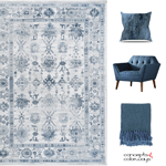
This color palette coordinates with my Coastal Style Living Room with Turquoise, Gold and Taupe Accents get the look post.