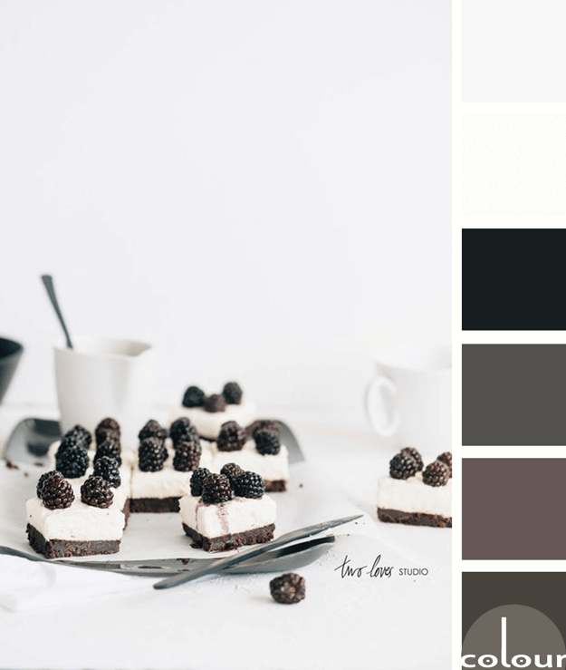
I like this take on black and white photography by Two Loves Studio. It isn't really a black and white photograph but, instead is a photo of a black and white subject. What I like most about this palette is that it isn't just black and white. Instead, it's a blend of various dark and light colors. ...
OPPOSITES ATTRACT
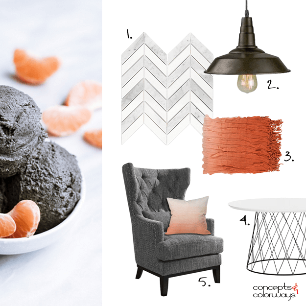
Creating an interior design mood board from the 'Opposites Attract' color palette was a lot of fun! I really like how it turned out. It has a modern look to it with an industrial vibe and some traditional pieces as well. A gray and white chevron mosaic tile could be used on the walls or floor. The ...
OPPOSITES ATTRACT

The 'Opposites Attract' color palette is inspired by a black sesame gelato recipe from Super Nummy. It features the grayish-brown color trend from Sherwin Williams called Sealskin that I showed you here. The rest of the palette is a blood orange, light peach, pale peach, cool gray and cool white. ...
BEACH BREEZE
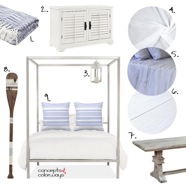
I've been dreaming of the beach lately. We're planning a little trip next month and I just can't wait to get there. Today's 'Beach Breeze' look is all about the white cottage beach style. Picture a white painted wood paneled room with an exposed wood ceiling. The floor would also be a white painted ...
LAVENDER CHEESECAKE
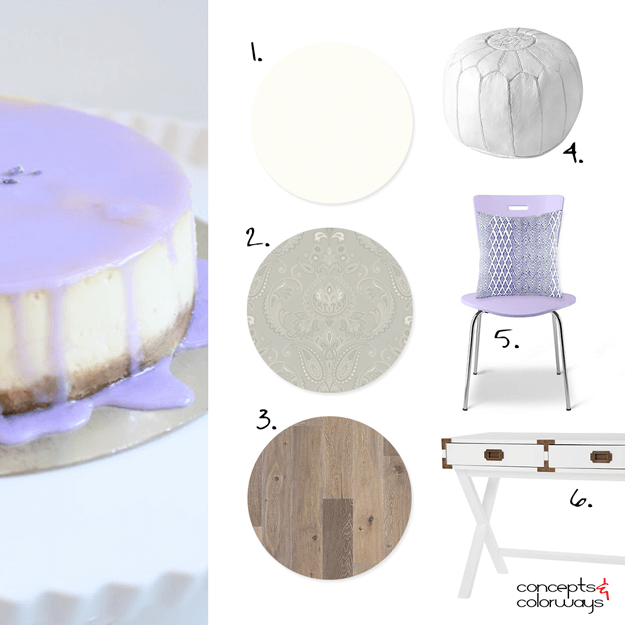
The 'Lavender Cheesecake' look is a gorgeous white interior with small pops of periwinkle and navy. The floor is a grayish-brown vintage oak plank and the walls are a pale ivory white paint. Sage gray damask wallpaper is used for wall accents. White furniture pieces dominate the furnishings with a ...
- « Previous Page
- 1
- …
- 41
- 42
- 43
- 44
- 45
- …
- 119
- Next Page »
