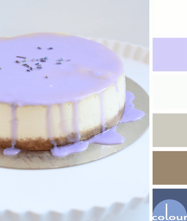
I'm always up for a dessert based color palette. This lavender drizzle makes such a beautiful display for your table but you could also use this palette for other designs. The color lineup for this look is a pale gray, white, periwinkle blue, pewter gray, warm brown and dark blue. The combination is ...
LAVENDER BROWNIES

The 'Lavender Brownies' color palette translates beautifully into an interior design. I picture a room with pale gray walls and a reclaimed gray wood accent wall. The dark blackish-brown of the brownies becomes a leather sofa. Then, the lavender drizzle is represented by periwinkle blue accent ...
LAVENDER BROWNIES
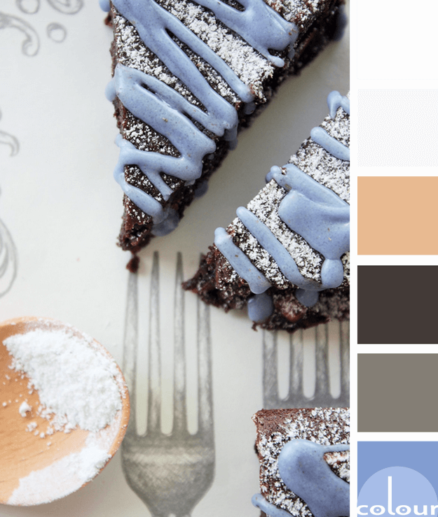
The 'Lavender Brownies' color palette is a yummy mix of dark brown with lavender blue. The main colors of the look are white and pale gray with a sprinkle of rose beige and metal gray as well. This palette displays the periwinkle color trend quite nicely, don't you think? I'm brewing up some ideas ...
BENJAMIN MOORE PINK BLISS
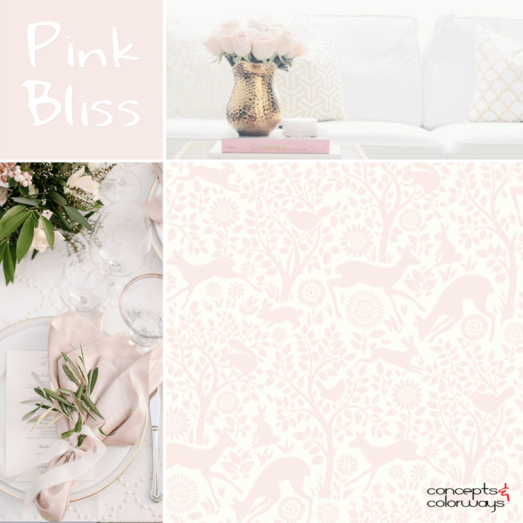
Pink Bliss. That's the perfect description for this ever so subtle pink shade. It's a pale version of the blush pinks that are so popular of late. I often see it paired with gold accents in white spaces for an unbelievably pretty look. Or, combined with grays and blacks for a bolder contrast. A ...
SUNNY DISPOSITION
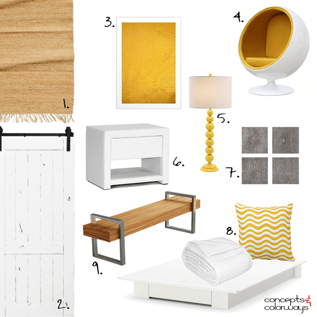
The 'Sunny Disposition' look is modern, classy and cheerful. It's a mix of white, golden yellow, light brown and gray pieces in a mostly white room. A distressed white wood barn door adds a rustic character to the room with black hardware for a pop of accent color. The bed is a white platform with a ...
- « Previous Page
- 1
- …
- 42
- 43
- 44
- 45
- 46
- …
- 119
- Next Page »
