
Bright red is a timeless classic. It may fall out of favor for a short time but it always makes a powerful comeback. So, I wasn't surprised to see a bold version of this color on the Pantone 2017 Spring Fashion Color Report. They call it Flame. A great name for an awesome color! This hue has been a ...
GRAPHIC VIBE
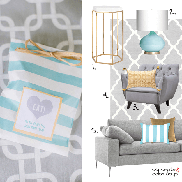
The 'Graphic Vibe' palette translates beautifully into an interior design. What I like best about this look is the largest surfaces and pieces are neutral colors. So, you can inexpensively switch out the accent colors for an entirely different effect. Let's take a closer look at the elements of this ...
GRAPHIC VIBE

So many pretty colors bundled in one gorgeous combination. This palette is definitely a keeper! The star player of this look is a beautiful light turquoise, paired with white, in a bold, modern stripe. This I love. The remainder of the lineup is a straw yellow, copper brown, lilac gray and warm ...
PANTONE GREENERY

How would I describe this color? I think the best description would be a lime green. But, apple green, bright green or spring green would also work. It's essentially a saturated green color with a lot of sass. Pantone has predicted this lovely hue as a fashion color trend for this coming spring. ...
PRIMROSE VISION
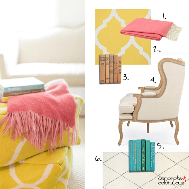
Yesterday, we explored the 'Primrose Vision' color palette but, how do you create an interior design in this look? Let's go over the individual elements that make up this design. You'll want to start with an ivory colored rug or carpet. I chose one with a very subtle diamond pinstripe for a little ...
- « Previous Page
- 1
- …
- 54
- 55
- 56
- 57
- 58
- …
- 119
- Next Page »
