
I'm a huge fan of color palettes with neutral base tones and small amounts of colorful accents. Using bold, saturated colors sparingly seems to lend more drama to the overall look. And, It's a nice way of adding a playful touch to an otherwise 'safe' room. The 'Primrose Vision' palette uses a creamy ...
BLUSH BEAUTIES
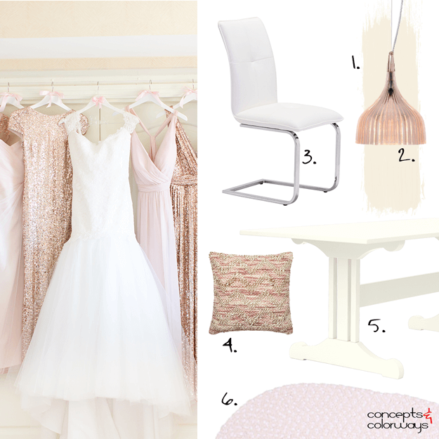
Yesterday we looked at the 'Blush Beauties' color palette. So, today let's explore how we can translate this palette into an interior design. I'm picturing a dining room with a blush beige wall paint and cream colored wood trim. A pale pink rug under the table adds a pretty touch to the look. ...
BLUSH BEAUTIES

What a heavenly color palette! I just love the layers of blush tones and creams with an accent of white and rose gold. This look is pretty enough for a little girls room but is sophisticated enough to work for grown up girls too. It might be a bit too much pink for most men but it could work in the ...
BENJAMIN MOORE SHADOW

Benjamin Moore has announced their 2017 Color of the Year and it's a good one! They call it Shadow. It's a sultry dark neutral in the purple family. I would describe this color as a purple-gray, slate purple, dusty purple or dark plum. It adds an intriguing combination of classy and fun to any ...
SHIBORI BLEND
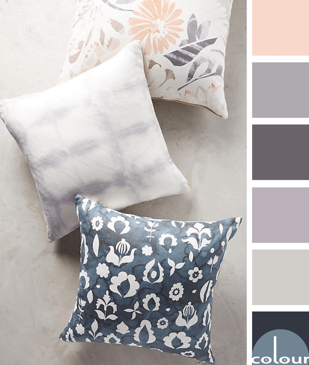
I just love the textures and patterns that Anthropologie comes up with. This pillow combination is a perfect example. The patterns are fantastic and the color palette...just gorgeous! The majority of the palette consists of soothing cool tones of navy blues and lilac grays with a warm base color of ...
- « Previous Page
- 1
- …
- 55
- 56
- 57
- 58
- 59
- …
- 119
- Next Page »
