
No doubt, the French provide an endless supply of design inspiration for us all to enjoy. Their architecture, and entry doors, are especially drool worthy. I think this mint blue door would translate beautifully into an interior design. Only, instead of using this pale blue color on the door, put it ...
FRENCH MINT

Today's inspiration is a gorgeous door image from one of my favorite photographers, Georgianna Lane. I love the soothing color palette it creates. The mint blue doors, light stone walls and purplish-gray pavers blend beautifully together. And, the subtle accents of taupe, navy blue and moss green ...
PANTONE HAZELNUT

I'm continuing my exploration of the Pantone 2017 Spring Fashion Color Report with a creamy light brown called 'Hazelnut'. You could describe this color as light brown, pale brown, caramel brown or camel tan. It has a natural feel to it and adds a warm glow to any interior space. There are so many ...
PARIS REFLECTION
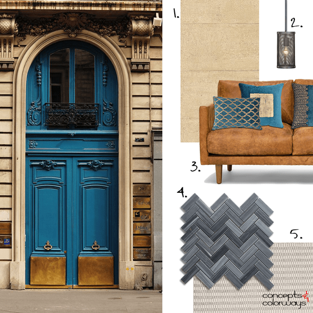
I don't typically gravitate towards dark interiors but this one I love!!! The black herringbone tile paired with the warm tan wallpaper. The copper sofa with the peacock blue accent pillows. The warm black pendant lights and the concrete gray area rug. The whole combination comes together to create ...
PARIS REFLECTION

The copper brown and teal blue combo is really catching my eye lately. Take these Parisian doors, for instance. The depth of the copper and peacock blue doors contrasts beautifully with the light tan stone of the building. And, the black and gray accents add even more interest to the look. The ...
- « Previous Page
- 1
- …
- 58
- 59
- 60
- 61
- 62
- …
- 119
- Next Page »
