
I'm a huge fan of repurposing old objects into interior design pieces. Travel trunks, for example, make great coffee tables. The designer of this living room went a step further and painted a travel trunk in a custom, mint blue color. I love the light, airy effect this color gives the trunk and how ...
COASTAL COZINESS
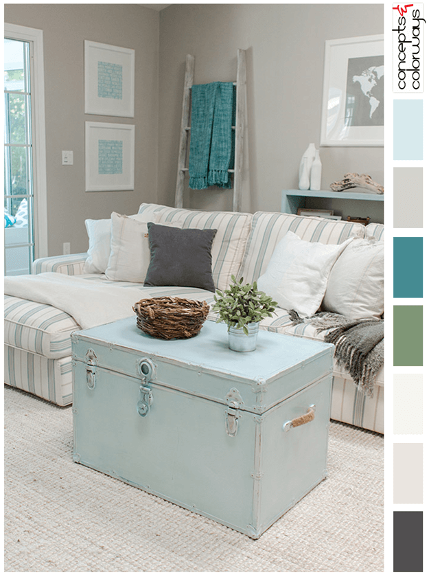
Mint blue is such a refreshing color. Just perfect for coastal style interiors. This pale blue color fits well in many different combinations. I especially like the color palette of this living room by Jenna Sue Design Co. The color roundup consists of warm gray, teal green, moss green, creamy ...
PANTONE PRIMROSE YELLOW

Oh...yellow. It adds brightness and cheer in a way no other color can do. Strategically placed in interiors as accents, it can really make magic happen. I especially like the bright tones of this color such as the 2017 color trend, Primrose Yellow by Pantone. This sunny hue looks best in white and ...
PASTEL VISION

Pastels can make a cheerful addition to any interior design project. The 'Pastel Vision' look features both mint blue to soothe your frazzled nerves and canary yellow to brighten up your day. The combo works really well in a neutral, putty white room with straw tan and blush rose pieces. A slight ...
PASTEL VISION
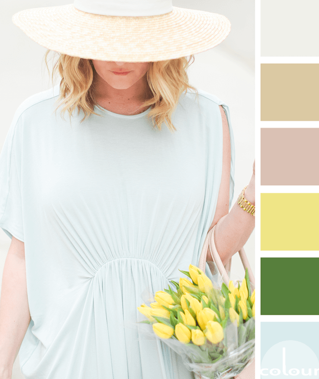
Today's palette is for the pastel lovers out there. If mint blues, canary yellows and spring greens really make you swoon, this might be the palette for you! I love the bold combination of bright colors mixed with a selection of more grounding, neutrals. The putty white, light brown and blush rose ...
- « Previous Page
- 1
- …
- 57
- 58
- 59
- 60
- 61
- …
- 119
- Next Page »
