
I came across this 'Dreamy Beachside' wedding inspiration the other day and was instantly smitten. This color palette is just beautiful! I would love to design a space using these soothing colors and textures. Some ideas are brewing in my head for this look. Here's what I have in mind... Get things ...
PANTONE WARM TAUPE

Introducing, today's Color Trend: Warm Taupe! More specifically, Pantone 16-1318. Today's color was selected from the Pantone Fashion Color Report Fall 2016. Now, this design really hits the spot for me. I absolutely love the rustic 'warm taupe' pieces paired with a dreamy gray color. Throw in a ...
COPPER POP
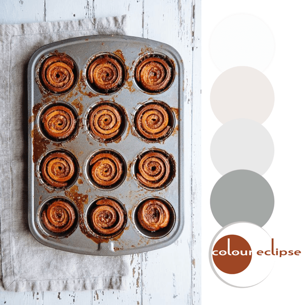
Mmm...sticky buns! They look delicious and are a great inspiration for an interior design. Metals, linens and white distressed woods with a pop of copper orange. I can just picture the space now.The walls would be a white washed ship lap wood with a feature wall of stainless steel mosaic tiles. ...
BLACK BEAUTY
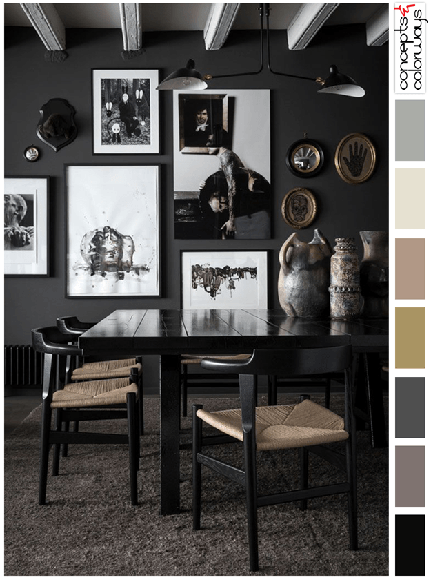
Dark interiors can create such a sophisticated atmosphere in a space. I especially like dark spaces with a 'pop' of white and warm toned accents like in this dining room design. The photographer did an excellent job of capturing the beautiful textures in the room. So, what does it take to re-create ...
PANTONE POTTER’S CLAY

Introducing, today's Color Trend: Potter's Clay! More specifically, Pantone 18-1340. Today's color was selected from the Pantone Fashion Color Report Fall 2016. Or, add it to a white room as accents for a brighter look. 'Potter's Clay' is the perfect color to go for when working with ...
- « Previous Page
- 1
- …
- 69
- 70
- 71
- 72
- 73
- …
- 119
- Next Page »
