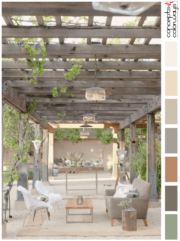
Would you like to 'Get This Look' for yourself? This outdoor living area would translate beautifully into an indoor space. Start this look with a sand colored floor tile and a taupe colored wallpaper. Include an accent wall with a gray-brown reclaimed wood paneling. Add a light beige area rug to ...
PURPLE WINTER
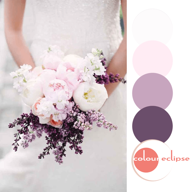
So, how would you translate this color palette into an interior design? Here's a little something I put together for this look. The base of the design starts with a white wash oak floor with pinkish-beige undertones. Pair this with a white glass subway wall tile to replicate the wedding dress. ...
BODACIOUS BLOOMS
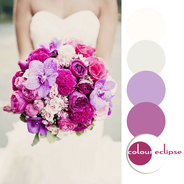
So, how would you translate this color palette into an interior design? Here's a little something I put together for this look. Start with a white oak flooring with cream and gray tones. Pair this with a creamy, off-white wall paint with tone-on-tone art pieces. Select a collection of beige, cream, ...
PANTONE RIVERSIDE
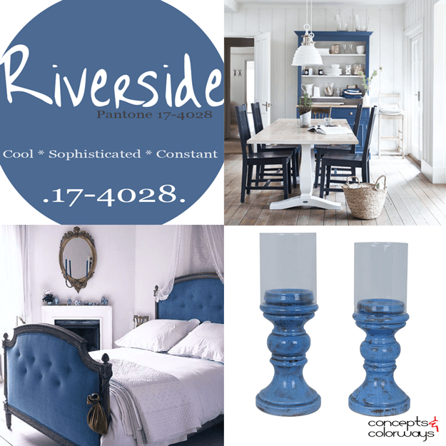
Introducing, today's Color Trend: Riverside! More specifically, Pantone 17-4028. Today's color was selected from the Pantone Fashion Color Report Fall 2016. This particular shade of indigo blue replicates denim quite well. Pair it with other dusty blues for a layered look. Or, really make ...
BODACIOUS HONEY
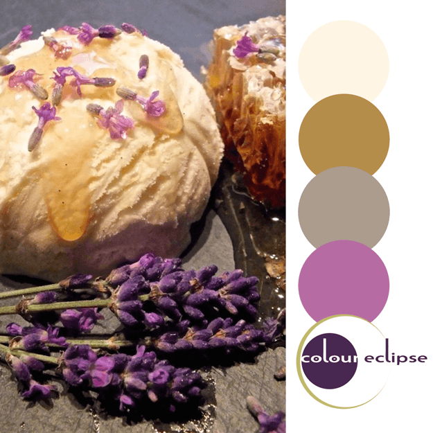
There's something absolutely gorgeous about the warm golden hues of honey and the gentle brightness of lavender. Just looking at the palette makes you feel invited and cozy, but also refreshed and bright. So, how would you translate this color palette into an interior design? Here's a little ...
- « Previous Page
- 1
- …
- 72
- 73
- 74
- 75
- 76
- …
- 119
- Next Page »
