
So, how would you translate this color palette into an interior design? I would start off with a black metallic floor tile and a pale celery green wallpaper. Center your furniture arrangement around a vintage-style aqua blue rug. Then, top off the look with a collection of furnishings in chartreuse, ...
WISTERIA EMBRACE
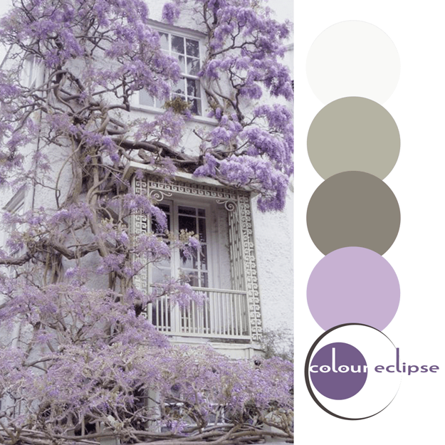
So, how would you translate this color palette into an interior design? I would start with white painted brick walls and a white ceramic floor tile. Add a touch of olive green mosaic tiles for accent and your surfaces are set. Continue with a collection of furnishings in the colors, patterns and ...
RUFFLED LILAC

So, how would you translate this color palette into an interior design? Here's a little something I put together for this look... Ottoman: Outpost Original Tibetan Lamb Gold Stool from Candelabra Flooring: St. Erhard Vinyl Planks Bleached Rustic Oak from BuildDirect Rug: Safavieh Patina ...
VIBRANT BOUQUET
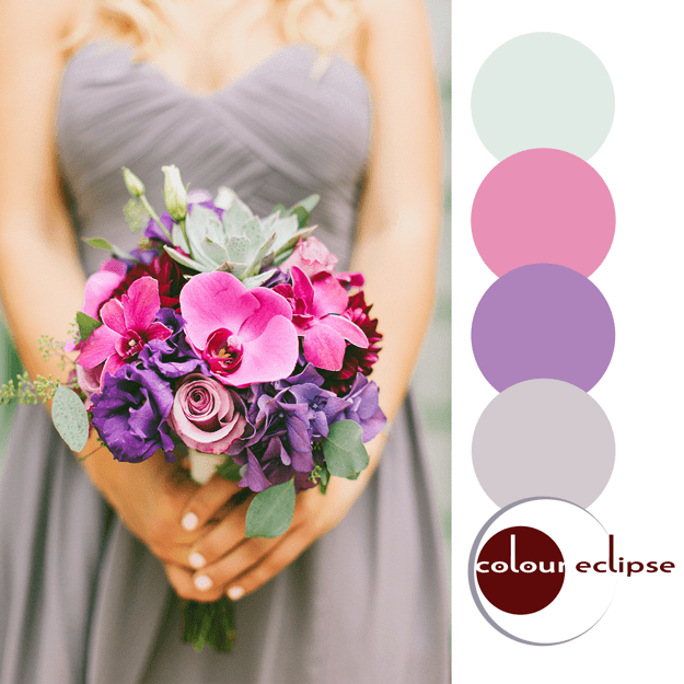
So, how would you translate this color palette into an interior design? Here's a little something I put together for this look... Chair: Kelley Purple Chair from Rooms To Go Kids Lumbar Pillow: Dark Red Dreams Throw Pillow on Zazzle Flooring: Bellawood Select Maple from Lumber ...
PANTONE BUTTERCUP

Introducing, today's Color Trend: Buttercup! More specifically, Pantone 12-0752. Today's color was selected from the Pantone Fashion Color Report Spring 2016 Just a touch of 'Buttercup' in a neutral interior adds an eye-popping focal point to the space. Shop this color (some cool things I ...
- « Previous Page
- 1
- …
- 74
- 75
- 76
- 77
- 78
- …
- 119
- Next Page »
