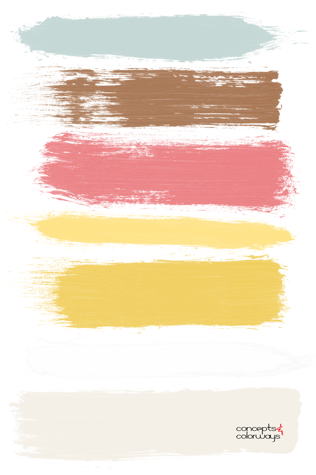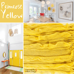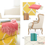
I’m a huge fan of color palettes with neutral base tones and small amounts of colorful accents. Using bold, saturated colors sparingly seems to lend more drama to the overall look. And, It’s a nice way of adding a playful touch to an otherwise ‘safe’ room. The ‘Primrose Vision’ palette uses a creamy white (or some might call it ivory) base for the largest surfaces of the space. Then small amounts of bright yellow, coral pink, copper brown and robin’s egg blue are used for accents. I love the result of this combination of colors. It’s cheerful, pretty and fun. What else could you want from a palette?

Coordinating posts you might like…


