
Oh my, my! This look is so perfect for me. I've been totally obsessed with this golden orange color for a while now but, when you pair it with dove gray. Heaven! In fact this gray and orange duo is just about the most gorgeous couple I've seen in a long time. Just look at how lovely the lacy gray ...
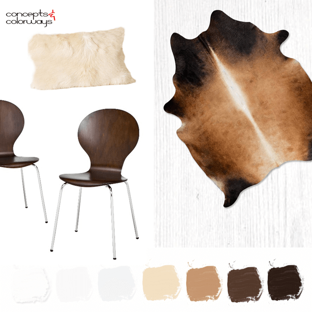
A WHITE INTERIOR WITH CHOCOLATE BROWN, CARAMEL AND CREAM ACCENTS
I woke up this morning with a new idea for the blog. A new category actually that I'm going to call Interior Color Palettes. I've been stuck for a while on how to explore the new color palettes that I develop from an interior design perspective. And, I think this solution just might do the trick. My ...
CHOCOLATE, CARAMEL AND CREAM

What a yummy color palette! The contrast of the cool white tones with the warm browns is just heavenly. Naturally, this enticing photo has me craving a root beer float. Luckily, Melissa over at Bisou / Style has a tasty Chocolate Caramel Stout Float recipe to go with this pretty photograph. And, if ...
PANTONE BUTTERUM
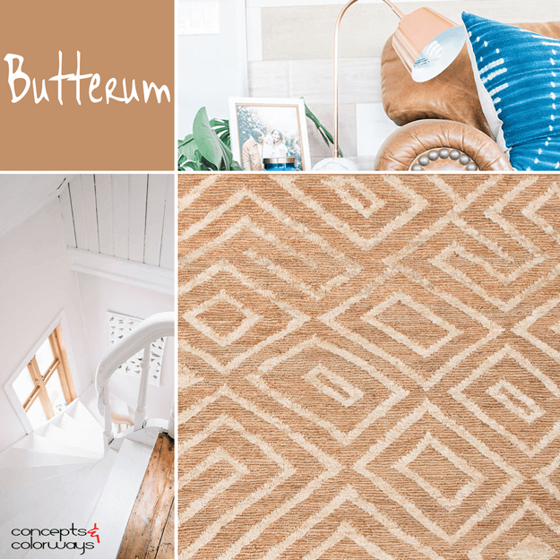
Mmm...Butterum. This color trend looks as yummy as it sounds. I've been particularly smitten with this particular shade of light brown for some time now, especially in leather pieces. I even have a pair of riding boots in this shade that I wear all winter long. Pantone has included 'Butterum' in ...
PANTONE HAZELNUT

I'm continuing my exploration of the Pantone 2017 Spring Fashion Color Report with a creamy light brown called 'Hazelnut'. You could describe this color as light brown, pale brown, caramel brown or camel tan. It has a natural feel to it and adds a warm glow to any interior space. There are so many ...