How do you make beige more interesting? Well, you could always combine it with some bold, saturated color accents in a mid-century modern design. Think, dark blue, hot pink, bright red, burgundy and lush green. It's a lot of bold color, I know, but you can balance the look out by using white walls ...
AZILAL INSPIRED
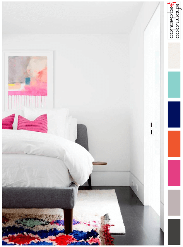
I'm a sucker for a white room with bright, colorful accents. This bedroom design is a perfect example of what I'm talking about. The majority of the color in this design is white with a bit of black and gray to ground the look. Then, colorful accents in hot pink, bright red, sapphire blue and mint ...
ROMANTIC INDUSTRIAL
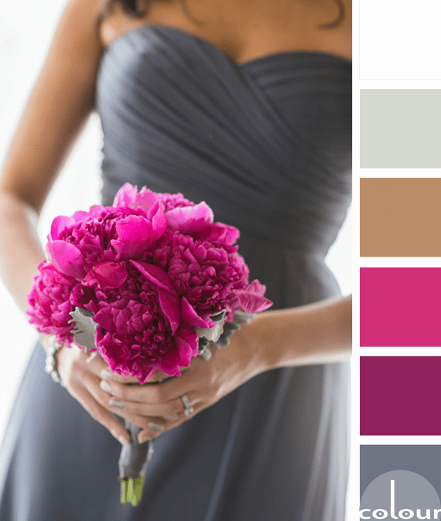
Now, this is the way to do industrial modern! The gunmetal gray dress. The fuschia bouquet with eucalyptus green accents. The smoky white background. Tie it all together with the mocha brown color of the bridesmaid's skin tone and this color palette is perfection. It would make a beautiful interior ...
PANTONE PINK YARROW
Nothing says 'girlie' like hot pink. It's Barbie's signature color after all and we're taught from a young age it's the stamp of femininity. I'm ashamed to admit I shunned this lovely color for many years. Why? I guess I just didn't like society telling me what I was supposed to like just because I ...
PRIMROSE VISION
I'm a huge fan of color palettes with neutral base tones and small amounts of colorful accents. Using bold, saturated colors sparingly seems to lend more drama to the overall look. And, It's a nice way of adding a playful touch to an otherwise 'safe' room. The 'Primrose Vision' palette uses a creamy ...


