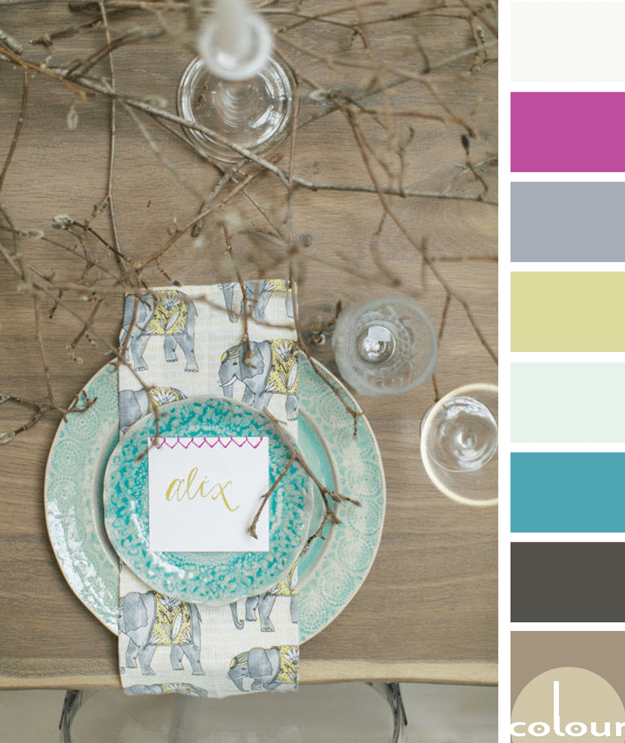
I just love rustic designs with a 'pop' of bright color. The 'Magnolia Frolic' palette is all that and more so, naturally, I love it! I'm especially drawn to the turquoise and chartreuse accents with just the slightest touch of hot pink. Lovely! Of course, I had to develop an interior mood board for ...
BASHFULLY GROUNDED
So, how would you translate this color palette into an interior design? Here's a little something I came up with for this look. Start things off with a taupe toned wood-look flooring. Pair this with a soft beige wall paint with a hint of blush pink. Continue the blush pink tone in an area rug to ...
DAZZLING GIRL TIME
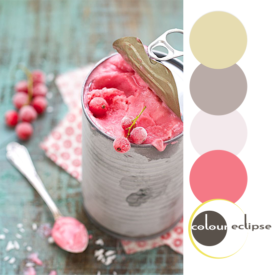
RED CURRANT CACHE
Paint Palettes {Birdie Tweet Boldness}
Would you like to Get This Look? Here are the fabric and paint colors to get you there: Fabric: Michael Miller Tweet Birdie Tweet Gray Fabric from OnlineFabricStore.net Paint: All colors from Sherwin Williams-SW0012 Empire Gold, SW6279 Black Swan, SW6846 Prominent Pink, SW6870 Ablaze, SW6008 ...


