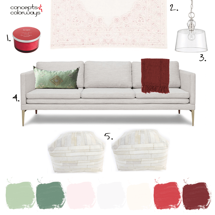
Red and green. It can throw off a strong 'Christmas' vibe, can't it? But, it can also be more timeless when done right. The key is in the other colors you use in the palette and the particular shades of red and green that you use. Take this living room design, for example. This would work great ...
A Color Palette Inspired by Pink and Red Flowers with Mint Green Accents
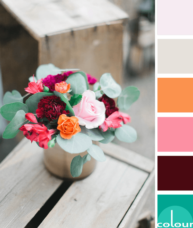
I don't usually work with pink and red together. But after seeing this color palette, I'm starting to reconsider. It's another gorgeous combination inspired by floral arrangements and it's totally stealing my heart at the moment. The photo was taken by a talented wedding photographer named Sarah ...
PANTONE ALMOST MAUVE – A BARELY THERE COLOR FOR BLUSH PINK DECOR
We're nearing the end of the Pantone Fashion Color Trend Report for Spring 2018. In fact, this is the last color for us to explore (sad). It's a pretty one too in a delicately, feminine kind of way. With blush pink decor being as popular as it is, this color is sure to be a crowd-pleaser. Pantone ...
ROSE MEDLEY (a pink and green color palette)
Floral bouquets are such a great source for color inspiration. There are infinite ways to arrange these and virtually infinite numbers of flowers and foliage to do it with. When it comes to Pinterest eye candy, this is one of my most favorite subjects. Take this pretty little pink and green number ...
PANTONE BALLET SLIPPER
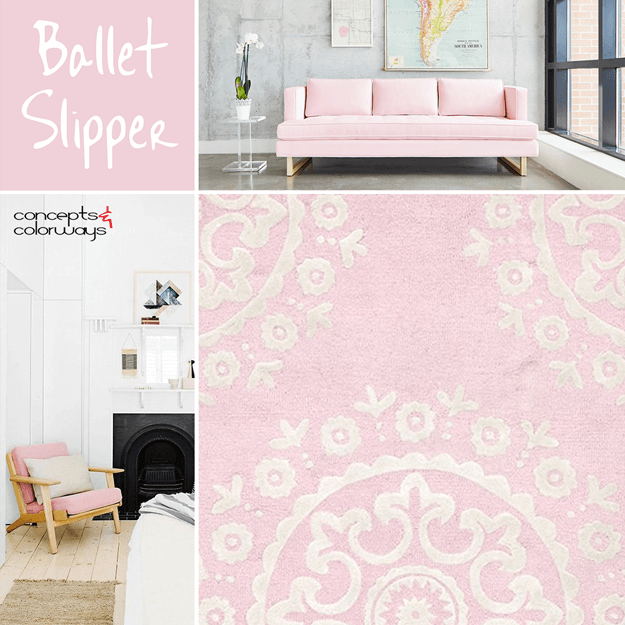
This is, hands-down, the prettiest color in the Pantone Fall 2017 Fashion Color Report. It's a soft shade of blush pink that adds a feminine touch to any interior space. I especially like this color trend as accents in white and pale gray interiors. But, it also works great with dark gray and black. ...


