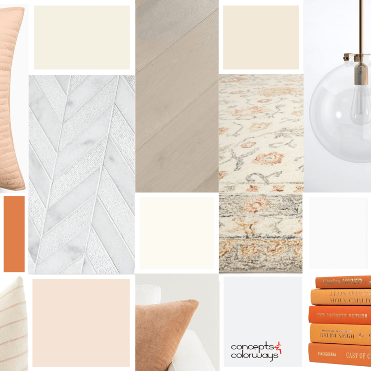
You know what this color palette reminds me of? A Dreamsicle! Do you remember those? You know, the orange flavored frozen treats with cream filling. (I might be dating myself here). Do they even make them anymore? I haven't seen one in a while. But, boy, were they yummy! And, this peach and cream ...
PANTONE SPICED APPLE
We're nearing the end of the Pantone Spring Color Trends for 2018. I have one more to show you after this one and that's it. But, don't worry, Pantone has a whole new collection of colors for us to explore for Fall 2018. I'm looking forward to getting started with those soon. But, for now, let's ...
HAPPY HOUR
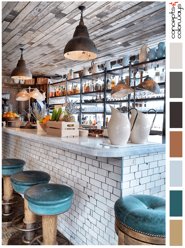
The 'Happy Hour' palette is a chill look with a "put your feet up and stay a while" kind of vibe. This look is all about reclaimed wood, weathered subway tile and dark teal accents. The color palette consists of a light brown, dark teal, pale blue, copper brown, warm black, charcoal gray, pale gray ...
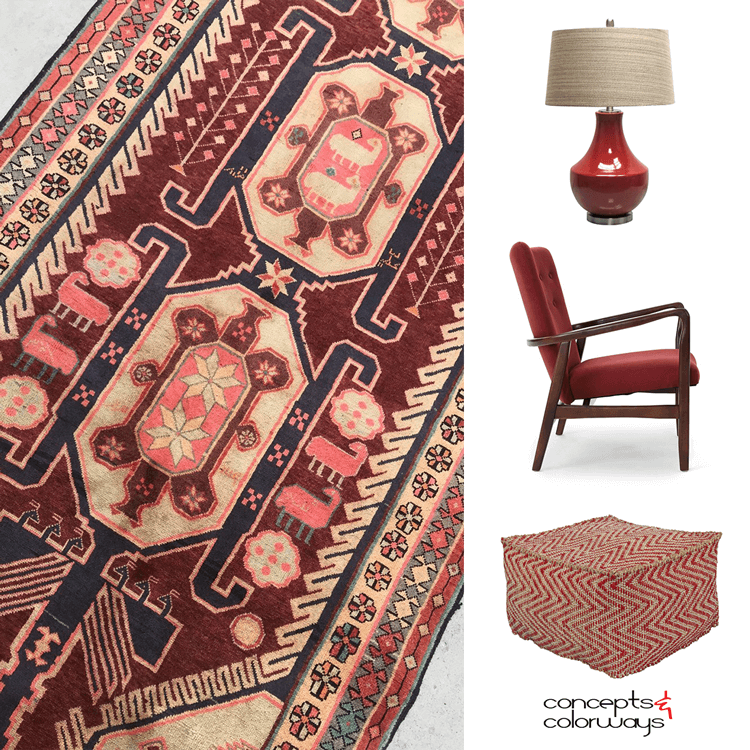
COLORFUL FOUNDATIONS

How do you make beige more interesting? Well, you could always combine it with some bold, saturated color accents in a mid-century modern design. Think, dark blue, hot pink, bright red, burgundy and lush green. It's a lot of bold color, I know, but you can balance the look out by using white walls ...
DREAMY BEACHSIDE

I came across this 'Dreamy Beachside' wedding inspiration the other day and was instantly smitten. This color palette is just beautiful! I would love to design a space using these soothing colors and textures. Some ideas are brewing in my head for this look. Here's what I have in mind... Get things ...