
I have an exciting guest post for you today from my new friends over at Décor Aid. They've offered to give us a personal tour of this beautiful mid century modern home from one of their talented designers, Sue B. I can't wait to get a closer look at this stylish home, so I'll turn it over to them to ...
A TEAL AND PINK COLOR PALETTE WITH A TOUCH OF CHARTREUSE

The popularity of teal in interior design is still going strong and I'm totally okay with that. It's a fun color with a retro vibe, yet it still feels modern. I really like what Decor Aid has done with teal in this mid century modern vacation home in Connecticut. The mix of teal and pink is a great ...
RUSTIC BRILLIANCE
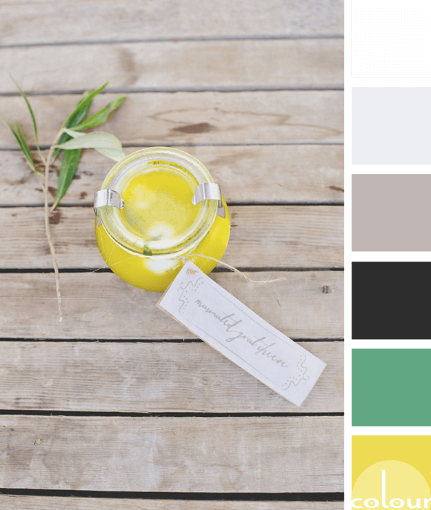
There's something about a bright yellow that just brightens up my day. It's about the happiest, most cheerful color I believe I've ever met. Pantone has included this particular shade of yellow in their Fashion Color Trend Report for Spring 2018. They call it Meadowlark. So, naturally I wanted to ...
TURQUOISE WATERS

The 'normal' person would look at this photo and wish they were at the beach. Or, they might picture themselves sitting on the rocks dipping their toes in the water. And, I have to admit that thought has crossed my mind too. But, it isn't the first thing I thought of. Oh, no. That would be too ...
b7a99a | A CHARMING TAUPE

Taupe isn't an in-your-face kind of color but more of a subtle neutral that adds depth to a palette. If taupe were a party guest, It would be the quiet one in the corner shrouded in mystery. While bright red or lime green are dancing on the coffee table, taupe would be the big brother making sure ...
- 1
- 2
- 3
- …
- 6
- Next Page »