
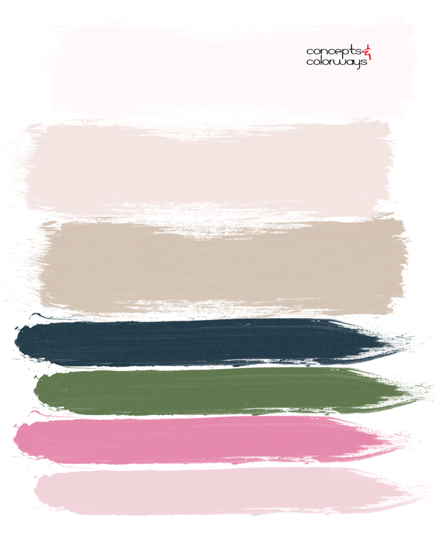
The ‘Blush Harmony’ palette is the perfect example of how to accent blush pink for a feminine, on-trend look. The interplay of colors in this photograph really draw me in and make me wish I were there. At the wedding. Taking in all the beautiful colors. The palest of pink bridesmaid’s dresses make a heavenly backdrop to the colorful bouquets. Which, are about the prettiest bouquets I believe I’ve ever seen. The mix of blush pink, hot pink and white are lovely. But, the slight pops of green, silver gray and navy blue are so perfect I can’t even stand it! The whole look is grounded by a neutral brownish-taupe floor color. I love it!
The paint palette drawn from this inspiration image would make a beautiful interior design. It’s feminine but fun, don’t you think?
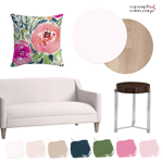
If you like this palette, you might also like my Ballet Slipper, Kale and Navy Peony color trend posts. My ‘A Pale Pink Interior With Navy, Hot Pink and Green Accents‘ get the look post coordinates with this color palette.

Like this post?
Please vote for me in the Amara Interior Blog Awards. It will only take a minute, I promise!

