I love being outdoors, whether I’m gardening, relaxing on my decking or swimming in my pool. I love getting my dose of fresh air and eat outside whenever I can. It was one of the main reasons I got the above ground pool put in – it would let me find another reason to be outside! There were lots of outdoor above ground pools available so I chose one that would fit in with the color scheme of my garden the best. I only realized I had such an obvious color scheme when I was looking into buying the pool – all the furniture, plants, etc. are all matching or work well with each other. I’d like to think I did it unconsciously due to my interior designer background but maybe everyone wants the blue and creamy tones I have put into my garden! At least this is what I thought when I made the Outdoor Living color palette that was inspired by my pool and garden.
When I first moved into my home, the garden was all grass and I found that, although it was pretty, there wasn’t really a space for me to sit outside and enjoy the sunshine when it comes around. So, I chose to convert some of the grass area into a small seating area with the use of some decking. A decking specialist came and fitted some composite decking for me and transformed my outdoor space into something fantastic. Now, I have some garden furniture on the decking that I can accessorize whichever way I like. This year, of course, I am turning to the blue tones to create a tranquil outdoor space and it’s working very well for me. I thoroughly enjoy coming to the decked area to have my lunch whilst the sun is still shining and I can hear the birds chirping.
The word that comes to mind when I see this color palette is soothing. And, who couldn’t use more of that in their lives? This table arrangement photo by Ruth Eileen Photography is another inspiration for this color combination. I’ve featured her work before in my ‘Muted Celebration‘ Palette by Project, ‘Primrose Vision‘ Color Palette and ‘Primrose Vision‘ Get the Look. Her ability to capture the color in her photography seems to keep drawing me in.
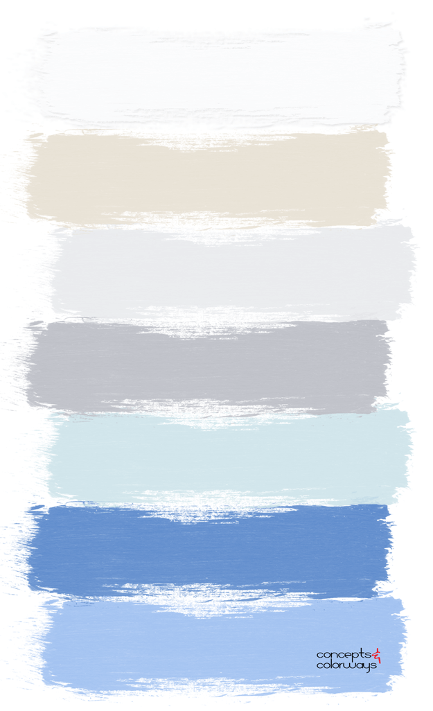
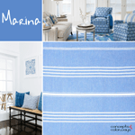
The ‘Outdoor Living’ palette starts with a weathered gray wood base. This not only introduces a lovely neutral but also the interesting texture of the wood. A light beige woven place mat contrasts nicely against this gray as well as the white and duck egg blue plate. Some might also call this a mint green or a robin’s egg blue. Then, small amounts of french blue are added for accent. This is a popular color trend right now that Pantone calls Marina. Overall, this is a beautiful color palette full of lots of design possibilities.
Here’s a peek at the ‘Outdoor Living’ paint palette for even more color inspiration…

Does this palette give you any interior design ideas? Drop us a note in the comments section below and tell us all about it!


